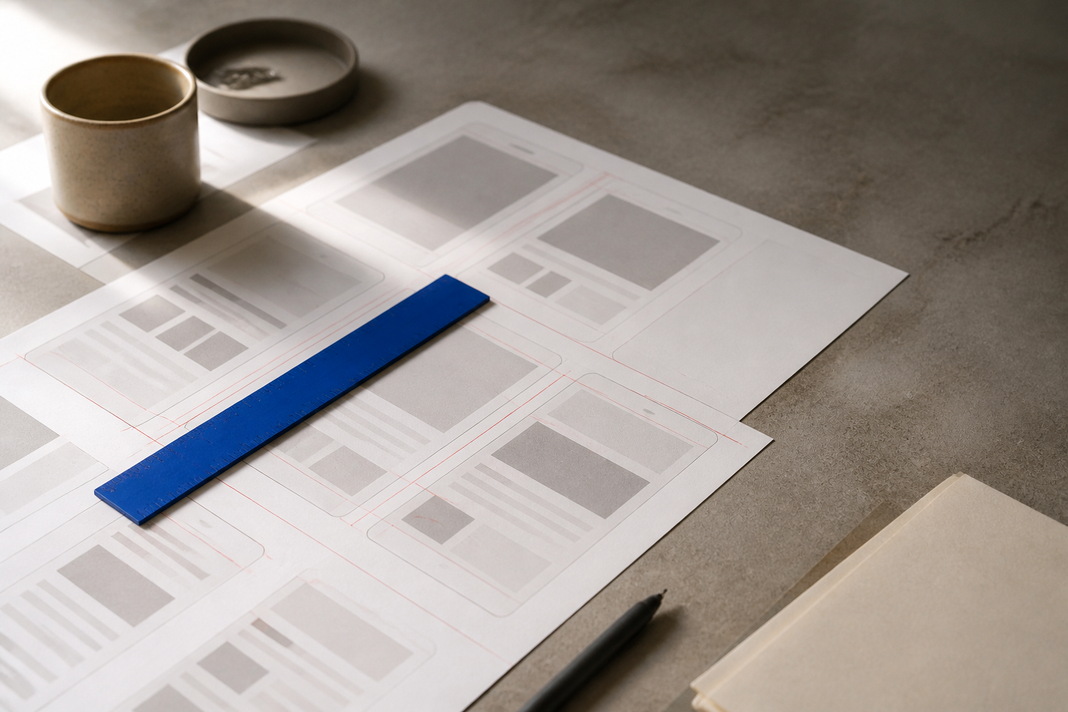
Use this before you send screens to a developer, an agency or a freelancer. It works for a new feature or an update to an existing app.
Run through each section against your mockup. Anything you can't tick becomes a question from the developer later, usually at the worst time. Fix the high-impact gaps first (see the table near the end).
Layout and structure
A developer needs to know what stays put when the page scrolls. Mark the header, bottom nav and any sticky bars so they don't guess.
Spacing is the biggest source of drift. If one card uses 16px padding and another uses 15px, a developer will copy both exactly and the UI will look off. Define a scale (say 4, 8, 12, 16, 24, 32) and label gaps by token name, not raw numbers.
States every screen needs
A screen is five screens. The "happy path" with three tidy rows is the one everyone designs; the other four are where builds stall.
For empty states, say what the user sees before data exists and what action moves them forward. For loading, pick one: a skeleton, a spinner, or an instant swap. For errors, write the exact message and whether the user can retry.
Tokens: type, color and spacing
Tokens are the shared vocabulary. Instead of telling a developer "this button is #2F6BFF with 14px bold text and 12px padding," you define color/primary, text/button, space/3 once, then reuse the names. Change the token later and every instance updates.
List each text style with all three properties. "Heading 20/28 semibold" means 20px size, 28px line height, 600 weight. Leave out line height and the developer picks one, and your buttons grow a pixel.
Behaviour and interactions
A static mockup can't show motion, so write it down. For every tappable element, state the destination or result. "Tapping Save validates the form, shows a spinner on the button, then navigates to the list on success" is buildable. A button with no note is a guess.
Forms need the full picture. Which fields are required? What does an invalid email show, and where? What happens when the server rejects the request? Specify these once per form pattern and reuse.
Annotating an update to an existing screen
Updating a live screen is riskier than a new one because a developer can accidentally rebuild things that already work. Don't hand over a fresh full-screen mockup and expect them to spot the diff.
Instead, annotate. Circle the two elements that moved, label the new field, and write "everything else unchanged." If the change touches shared components, say so — a tweak to the primary button changes every screen that uses it.
What goes in the PDF vs the ticket
Keep the two jobs separate. The PDF is the source of truth for how it looks — it doesn't change often and everyone references the same version. The ticket is the unit of work: what to build now, in what order, and how you'll know it's finished.
A ticket should link into the PDF rather than copy screenshots that go stale. Acceptance criteria turn the design into checkable statements: "User can submit the form; invalid email shows inline error; success navigates to list."
The copyable checklist
LAYOUT
[ ] Fixed vs scrollable marked per screen
[ ] Spacing uses named tokens
[ ] Mobile + desktop breakpoints shown
[ ] Max content width / grid stated
[ ] Safe areas handled on mobile

CONTENT
[ ] Empty state
[ ] Loading state
[ ] Error state + exact message
[ ] Long content / overflow shown
[ ] Real sample text, not lorem ipsum

BEHAVIOUR
[ ] Result of every tap / link
[ ] Hover, focus, pressed, disabled states
[ ] Form submit: success / validation / server error
[ ] Transitions noted (with duration if it matters)
[ ] Gestures defined (swipe, pull-to-refresh)

ASSETS
[ ] Icons exported (SVG where possible)
[ ] Images at required resolutions (1x/2x/3x)
[ ] Fonts named with weights, plus license note
[ ] Logo files in needed formats
[ ] Color + type + spacing tokens listed once
How to prioritise
Fix the gaps that stop a build before the ones that only polish it.
| Issue | Impact | Effort |
|---|---|---|
| Missing error and empty states | High — blocks the build | Medium |
| No mobile layout | High — forces guesswork | Medium |
| One-off values instead of tokens | High — causes visual drift | Low |
| Unspecified form submit behaviour | High — wrong logic shipped | Low |
| Missing hover/pressed states | Medium — needs a follow-up | Low |
| Icons not exported | Medium — slows the build | Low |
| Animation durations absent | Low — safe defaults work | Low |
Start with states and submit behaviour — those change what gets built, not just how it looks. Tokens are low effort and high payoff, so do them early too.
Questions people ask
Do I need redlines with exact pixel measurements?
Not if you provide tokens and a spacing scale. A developer can place elements from "gap: space/3" more reliably than from a measured 11px that was meant to be 12. Redlines help for one-off layouts that don't fit the scale.
Should I hand off a Figma file or a PDF?
Both have a place. A live file lets a developer inspect values and copy tokens; a PDF freezes a version everyone can reference and comment on. If you only send one, make sure it carries every state and token, not just the happy-path screens.
What if the developer and I are the same person right now?
Still write the states and submit behaviour down. Future-you building the error case three weeks later counts as a handoff, and the notes stop you from re-deciding the same things.
Doing this faster
Producing every state, token and annotation by hand takes time. In the UI Design Studio, you describe your app or upload screenshots and Yuki designs each screen as real, editable UI in your brand. You can tap to change anything, click through the flow, share a review link for comments, and download a PDF spec, PNG screens or React code — the formats this checklist asks for.
Next step
Open your current mockup and run the copyable checklist top to bottom. Mark every item you can't tick, then work the high-impact rows from the priority table first: states, submit behaviour, tokens. When the list is all green, your developer can build from the file without a single clarifying message.